Branding /
Developing a cohesive and distinctive brand voice for a SaaS company; redefining brand strategy, identity, visual design, messaging, tone of voice.
Art + Creative Direction, INDG / Grip 2021 — 2022
What is Grip?
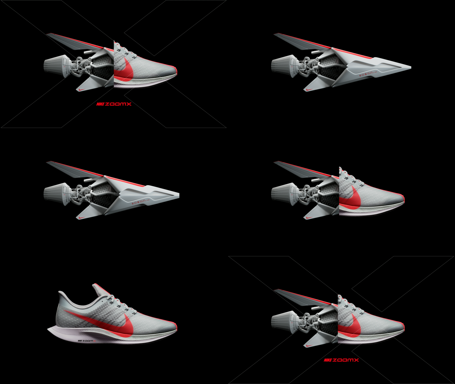
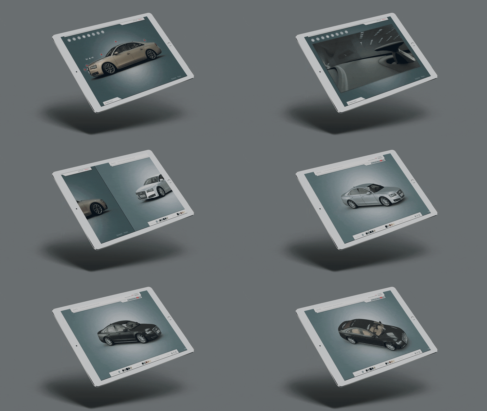
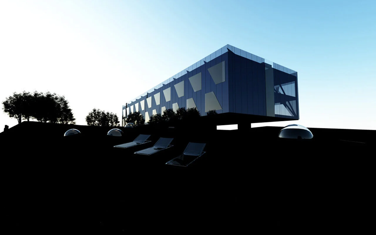
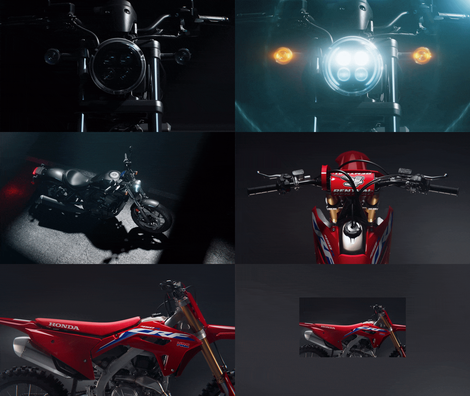
Grip is a Software as a Service (SaaS) primarily used by multinational consumer brands to automatically generate visual content based on photorealistic 3D, also known as Digital Twins. The software allows anyone (often marketeers and product / category managers) to create rich visual content for any product in the world. Guaranteed on-brand. Once a specific product is set up in Grip, the software basically takes care of the (mass-)production and adaptation of content (film + image), making sure everything’s fit-for-format, consistent and according to the clients’ brand guidelines.
Typical tasks include the adaptation of labels and packaging according to different markets and languages, delivering required output formats for specific channels, etc. All within seconds and without any repetitive work to be done manually, as opposed to days and weeks with traditional agency cycles. Grip's patented technology enables companies to produce 10 times the visual content at 10 times the speed, all at the same cost.
Analysis of current state + Briefing
Grip is primarily a business-to-business solution and is used by the majority of large CPG companies today, which is quite a success indeed... However, it was also identified as a major limiting factor for future growth ambitions.
The challenge for Grip was to improve engagement with their current client base and to further expand into new markets and mid-sized client segments through a completely new brand identity and tone of voice. The current language is conceived as too technical / abstract and therefore limited to a very specific audience.
As a goal we defined to make GRIP a legendary company, a lovable brand by the way it represents itself in the broadest sense. Developing a completely new brand identity / personality, visual design and communication materials incl. website, presentations, videos, social channels, copy, etc.
Early explorations
The very first explorations were aimed at redefining the visual principles, incorporating ideas that reflect the capabilities of the software; like automation, modularity, simplicity, playfulness. However, these ideas were heavily leaning into a graphic- and motion design direction, which eventually would be very hard to produce (for non designers) in the end. The directions were cool in a way but didn’t feel easy-to-approach and to execute for the in-house team of designers, they were failing also to communicate a certain friendliness and distinct personality.
Creative Approach
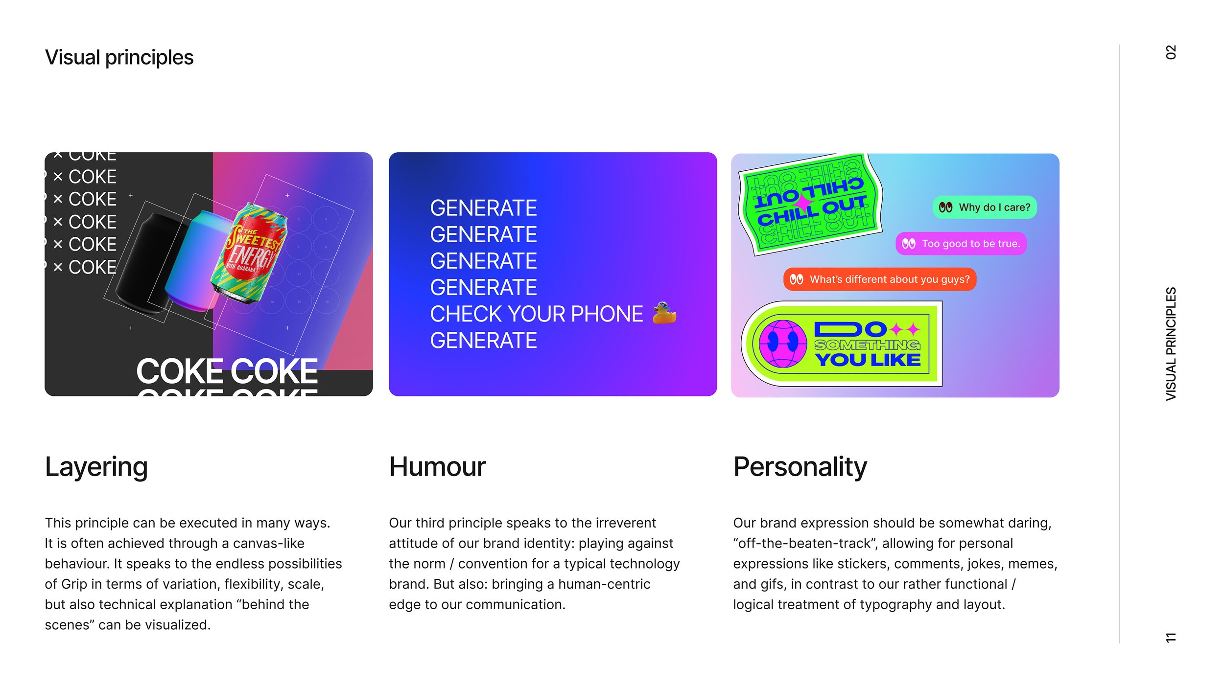
The creative approach was to develop a much more friendly, open and conversational style in both language and visual terms, instead of the very technical, solution oriented voice Grip currently had. Grip should not be conceived solely as a software solution for automation of workflows and content production. Instead the whole thing should act and feel like a real person, a good friend welcoming you at home, with lots of tips and stories and inspiration along the way towards creating amazing things together.
Grip should feel like a place full of inspiration, where any product in the world is represented with “state-of-the-art” / beautiful content that’s made for the digital-first-world we are living in today. Always and instantly available, and without the hassle of traditional content production.
Let’s not rebuild, but lift up and celebrate the ingredients that have shaped Grip’s identity. Let’s reinforce the story and personality of “the Grip”, which is based on traditional film-making on a set, whereas the company roots are in 3D and digital / virtual space. Let’s embrace what we do and how we do it. Let’s talk about who we are.
Above all, we’re aiming to build something way bigger here, because Grip is not alone. From everyone creating Grip, to the users making sure this thing gets off the ground, we’re a collective of enthusiasts going all-in to make beautiful content together (let’s celebrate the community, our users and the people behind Grip).
Let’s not take everything (including ourselves) too serious. In fact, we don’t always know what’s next, and we like it that way. Because multiplayer / community is everything — our how and our why. It’s powered by all of us. This started as a place to visualize products and generate content. Together, we’re making it the real Grip now.
Establishing the new brand
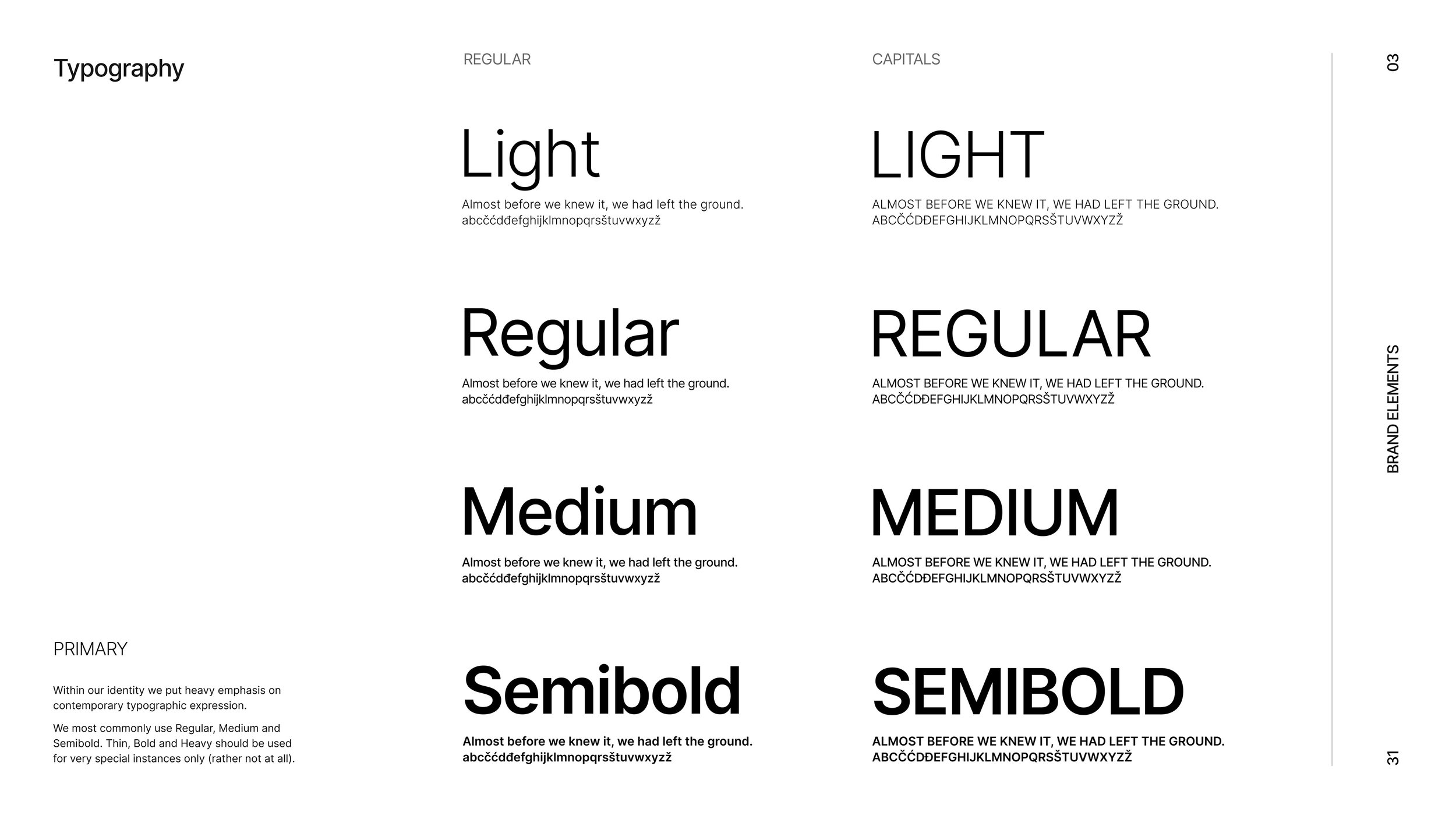
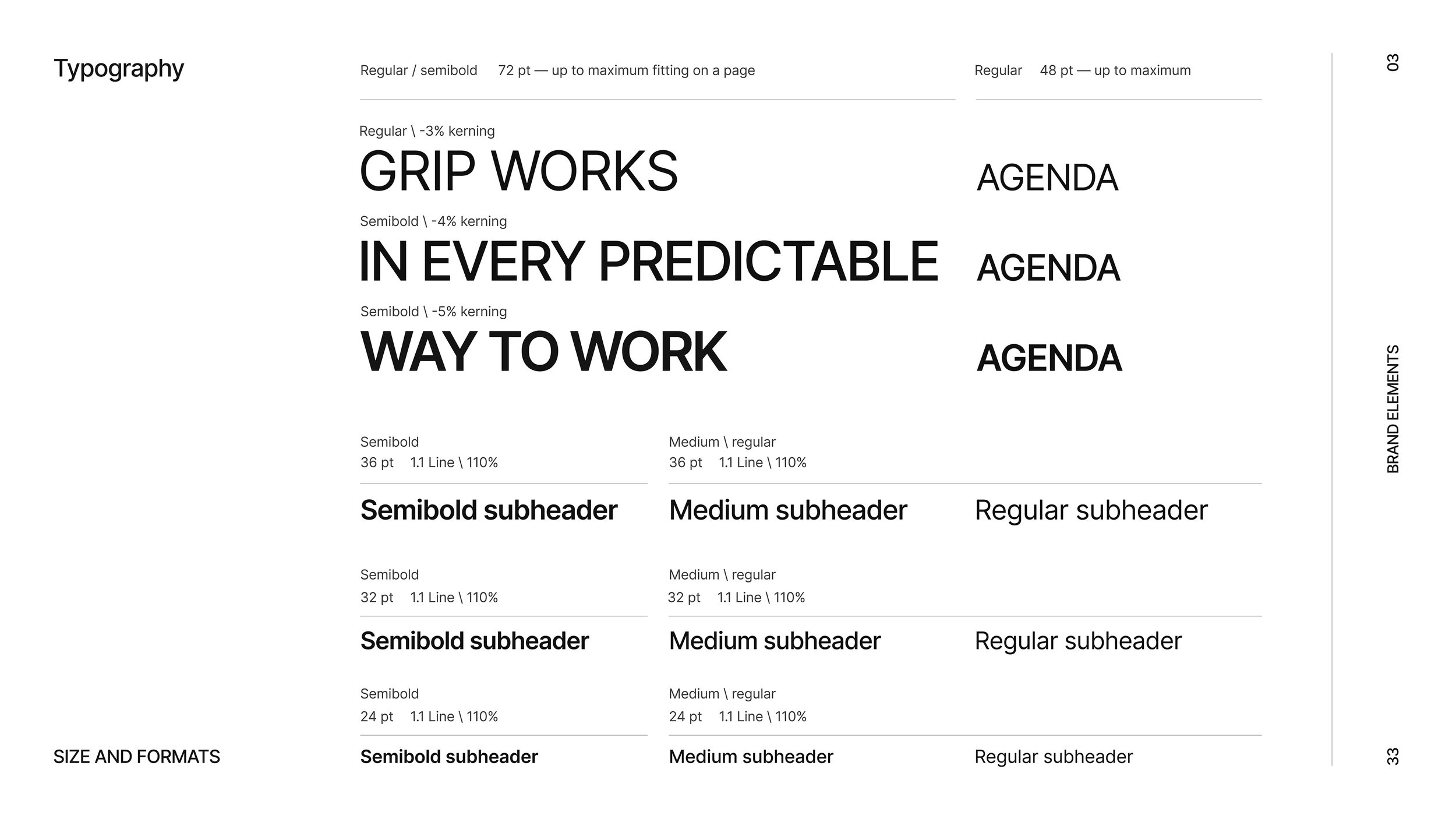
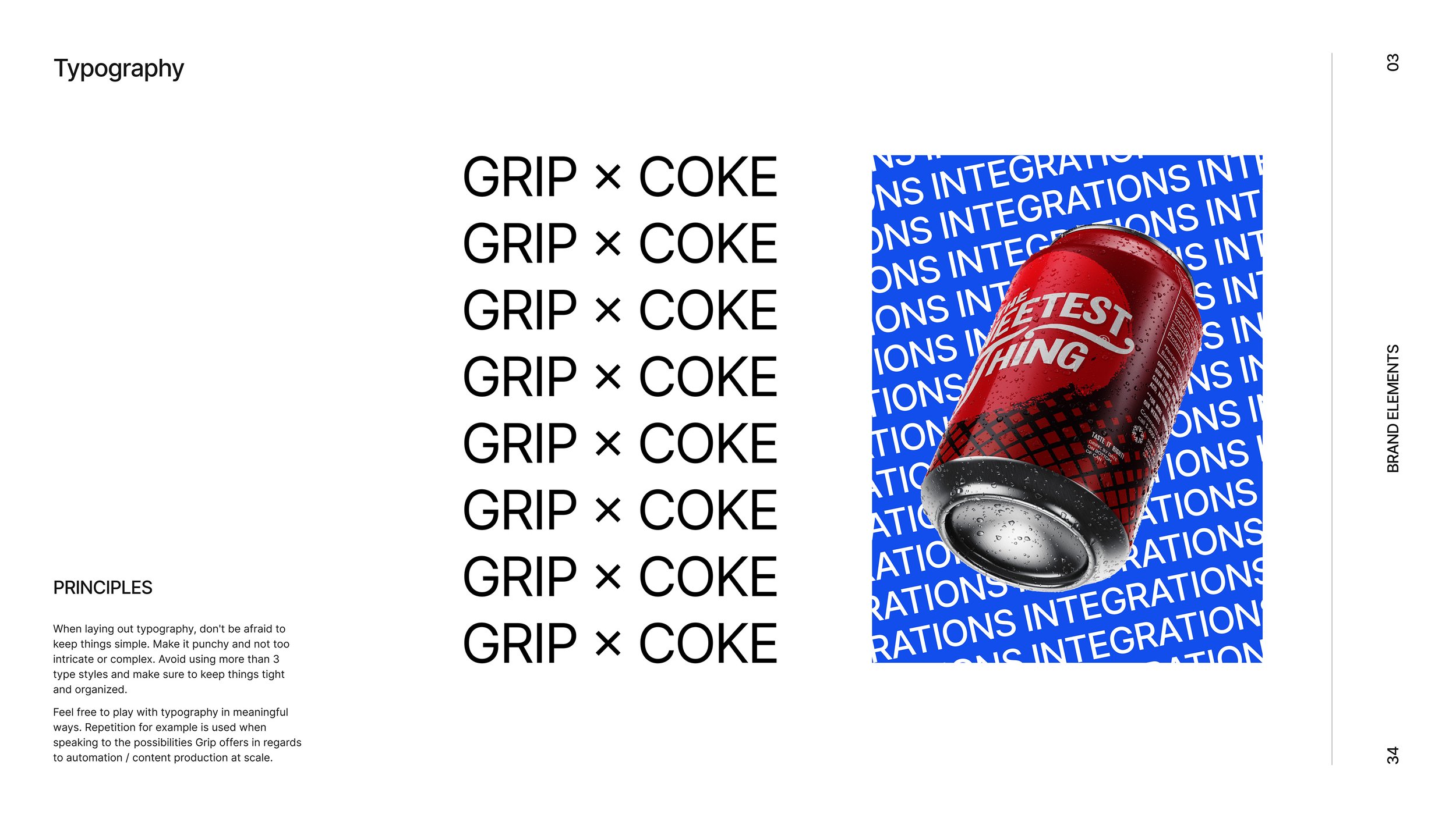
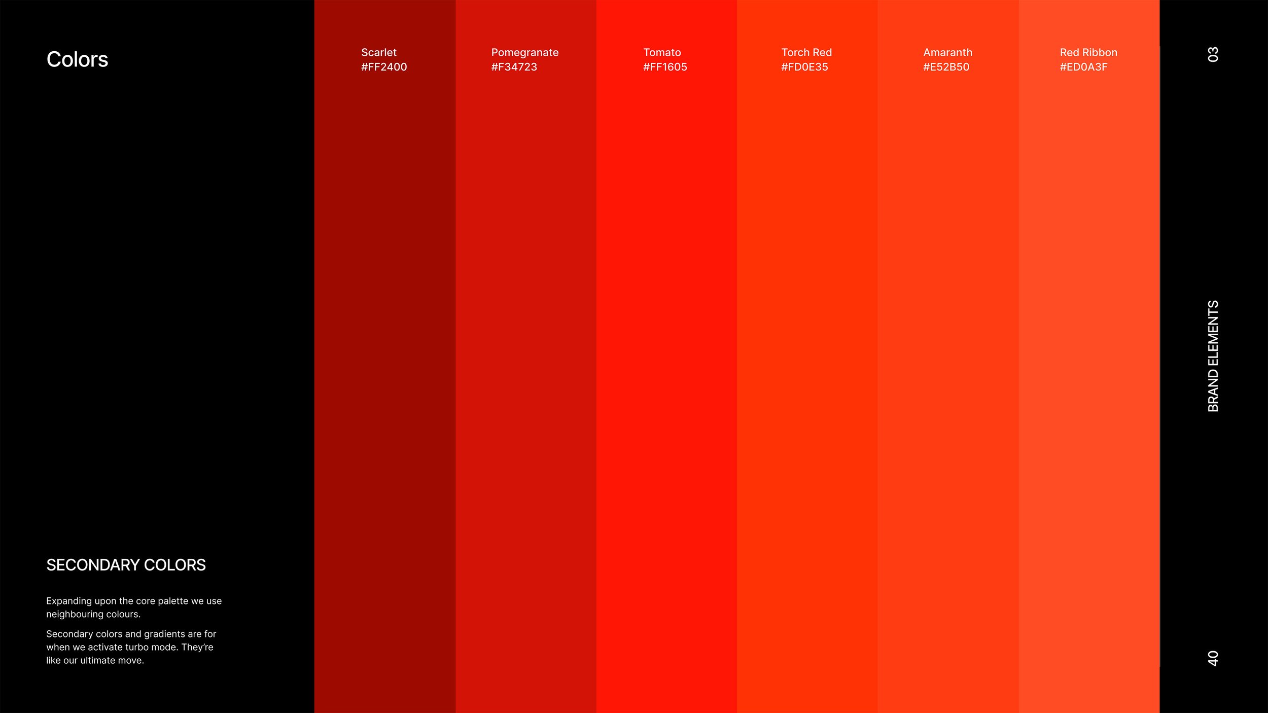
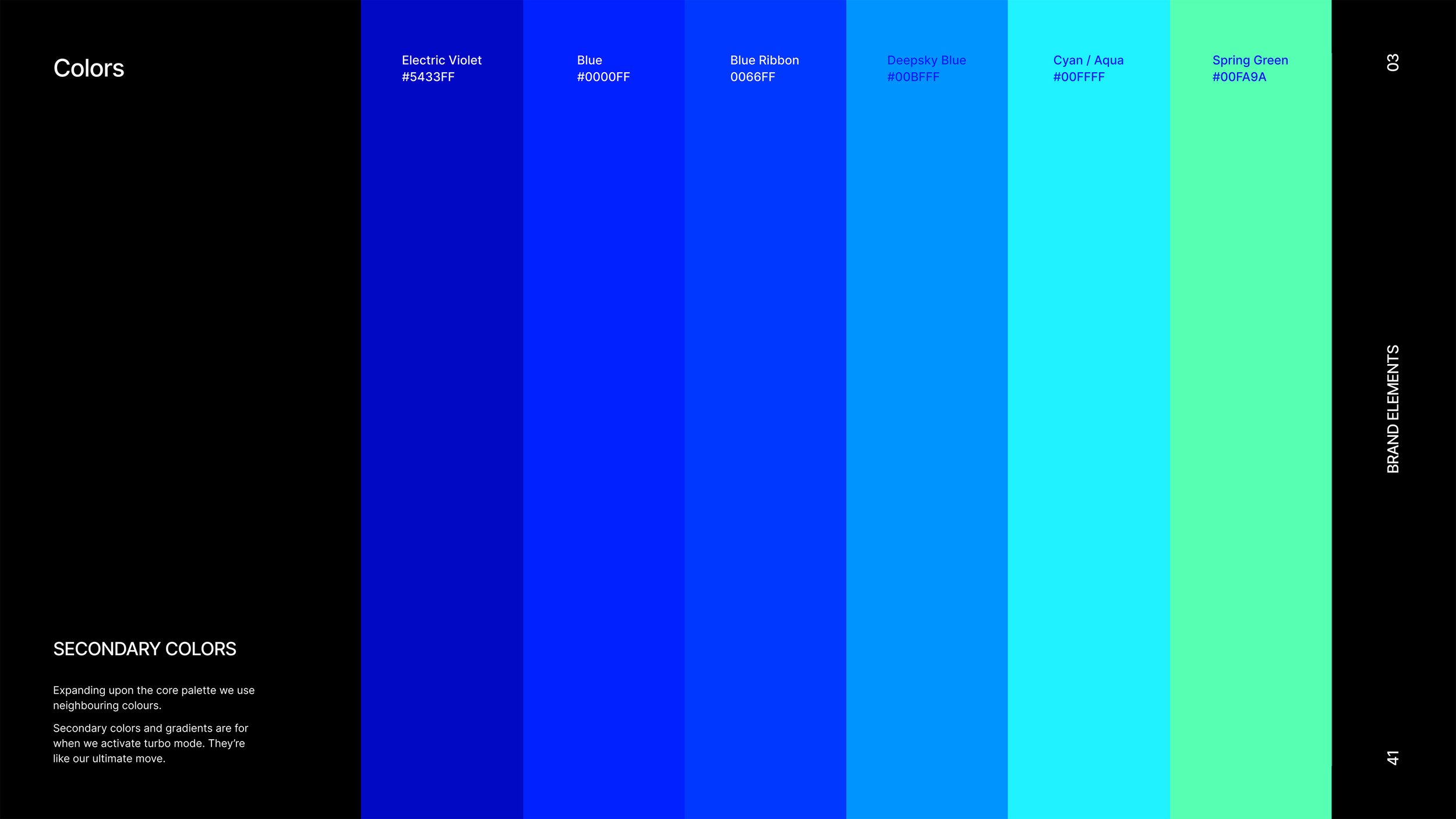
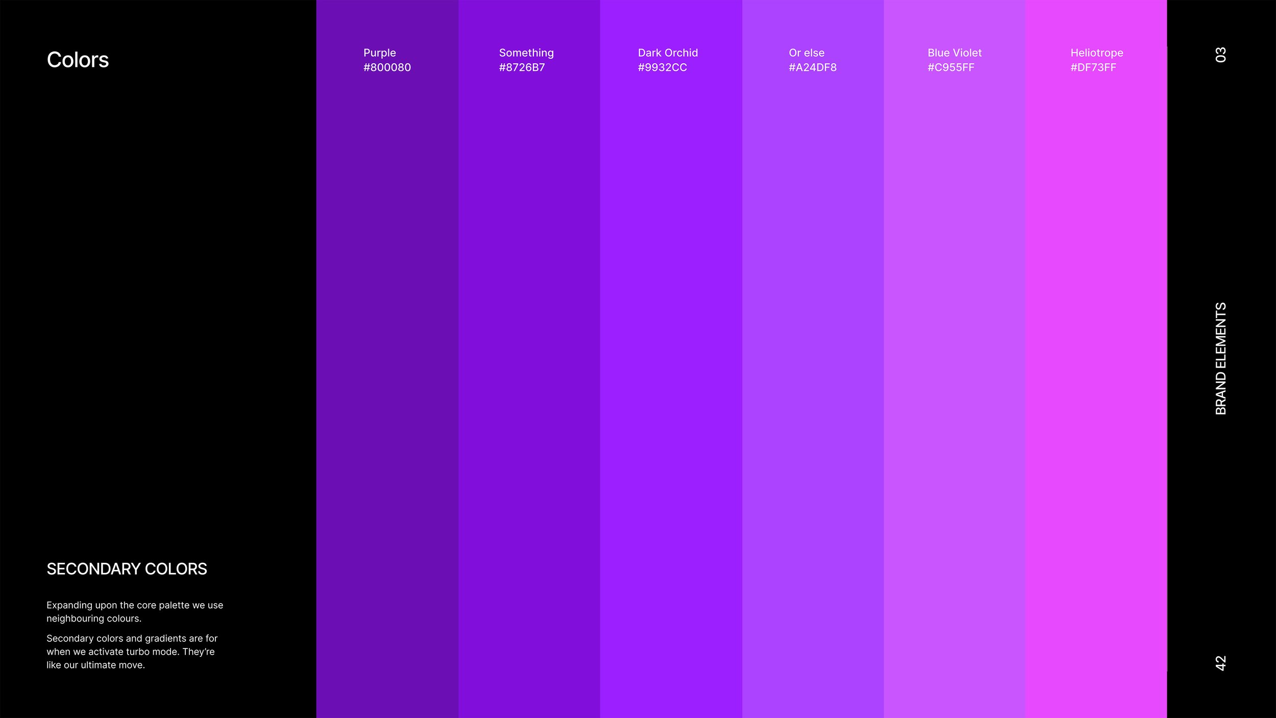
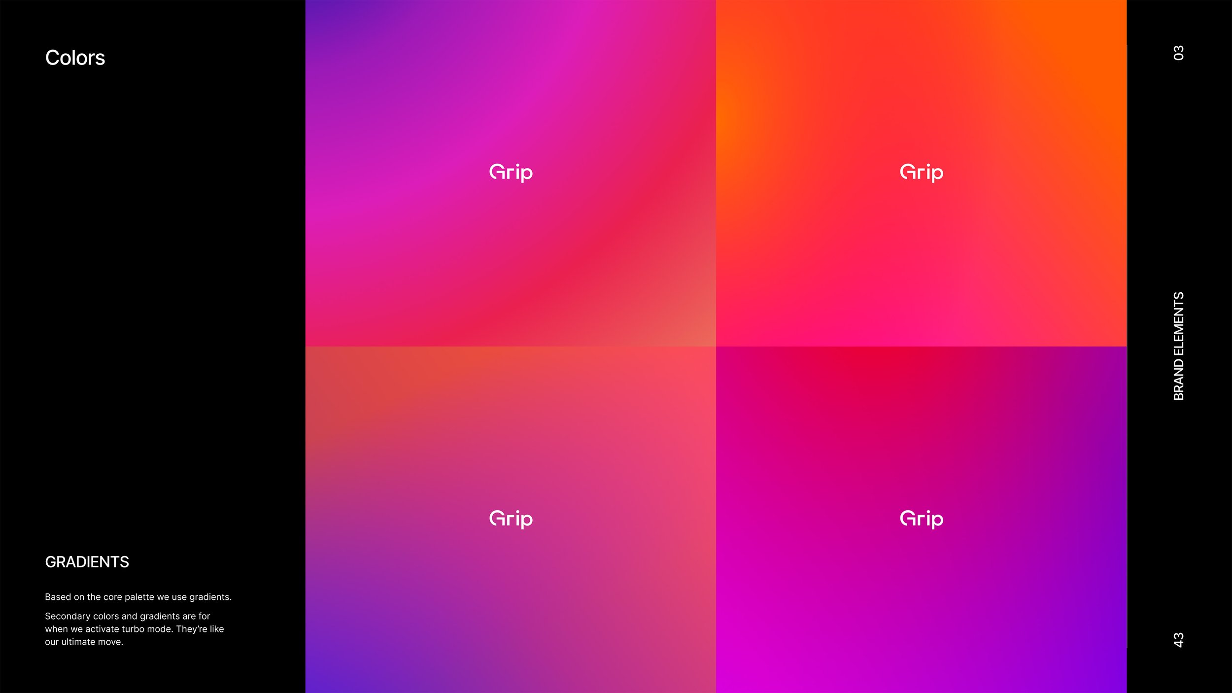
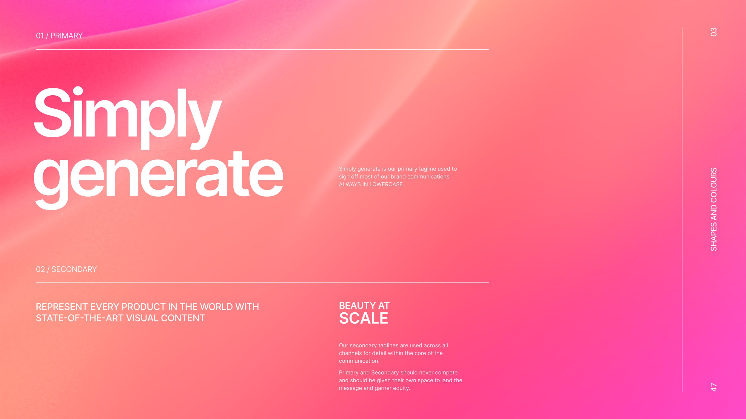
The best way to define a brand is to create a brand guide first of all. So that's what we did. It’s quite a process, took about a year to get everyone on board with how the brand should look, feel, and communicate. Take a look and see for yourself 👀
Tired of scrolling?
Watch the video below for a quick summary of the brand book ◕‿◕
Almost done
Incorporating the new brand identity and visual design across all communication materials, we continued to design a full website, client facing presentations, video for social channels, etc. Also the software itself received a major update. But that’s another story…
